Kids in Crime
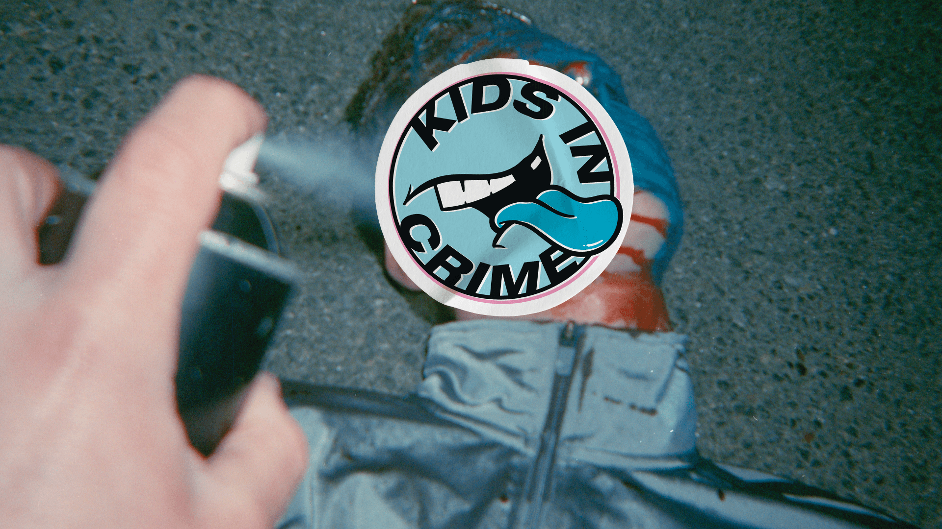
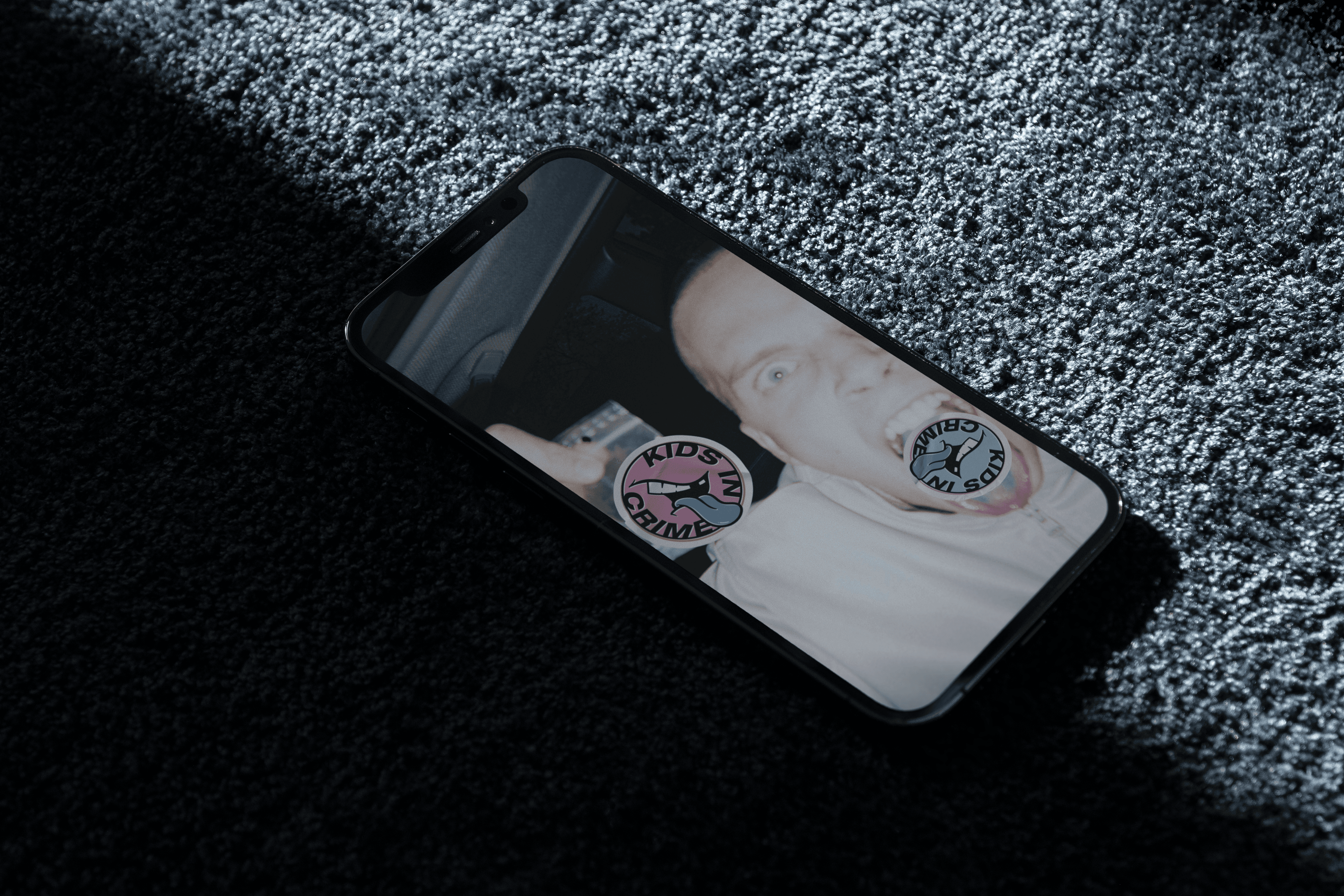
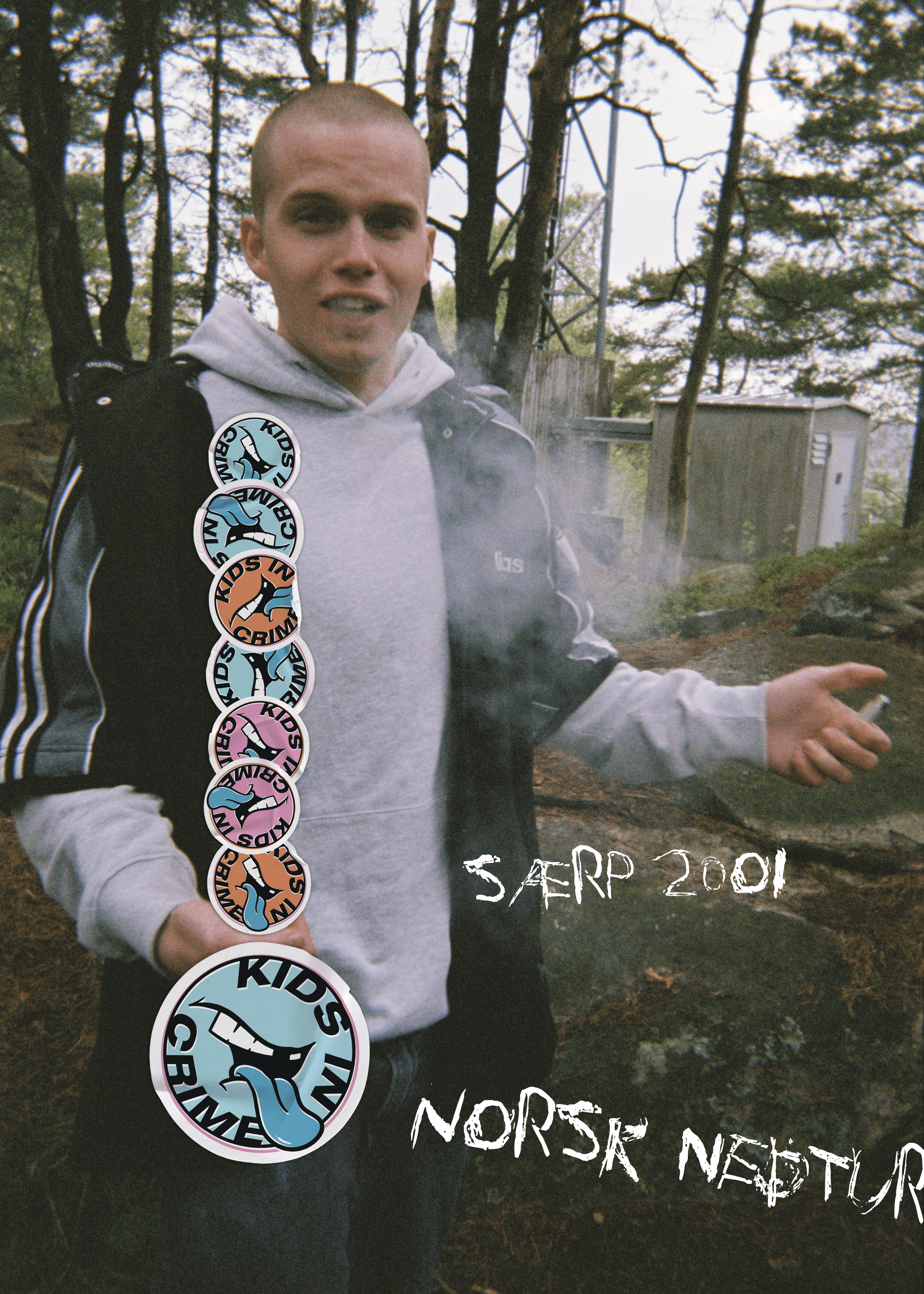
We wanted the tv series’s visual identity to reflect its production’s authenticity. And, since this tv-series is of graphical content, our idea was that the design for the tv-series should help the tv-network to publicize teasers and billboards with imagery that generally would have to be censored or be pulled from social media. The solution is a logo that works as a sticker: A physical logo that can be used on top of images and films to hide parts that show drugs, sex, and violence. The sticker would also reflect the typical behavior where teenagers would stick it to walls, skateboards, public places, public toilets, etc.
The result was a visual identity that works as an extension of the tv-series and gave an authentic launch campaign that engaged new and younger audiences for the tv-network.
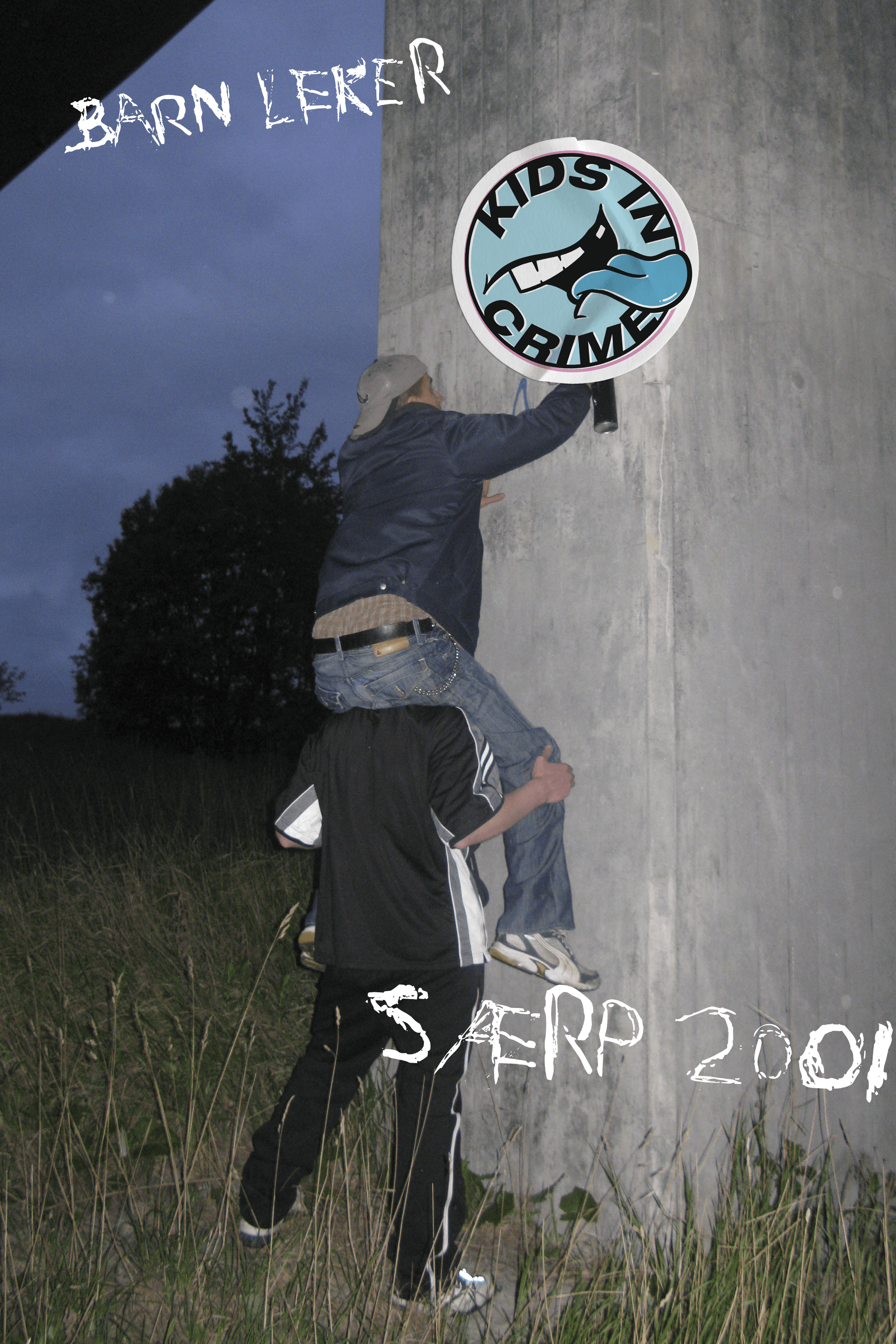
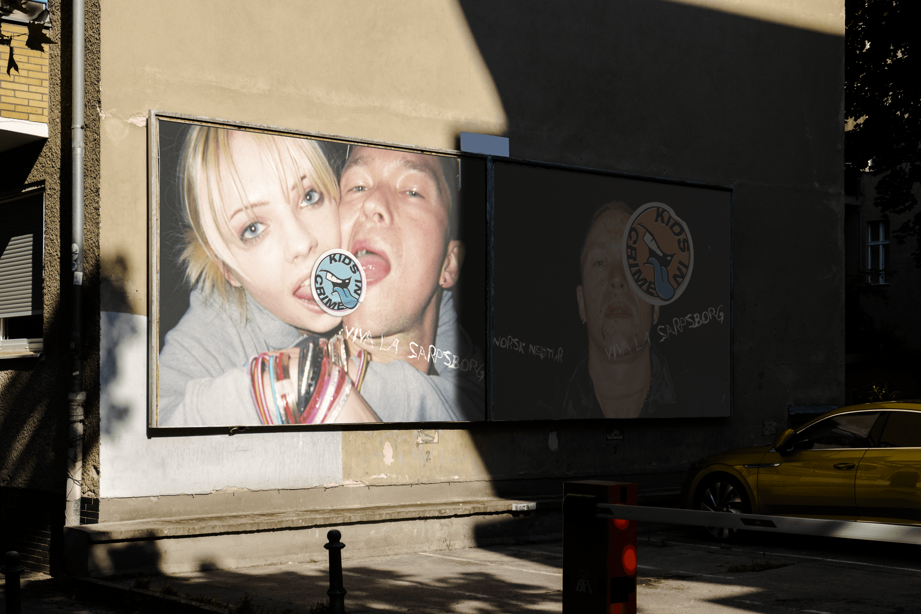
For authenticity, the images used as a part of the visual identity and launch were taken with disposable cameras during the show’s production. This gave realistic photos that didn’t look like “advertising.”
The design is inspired by the period of the early 2000s. The blue tongue indicates the use of Rohypnol. Physical stickers were also produced and distributed as a part of the launch.
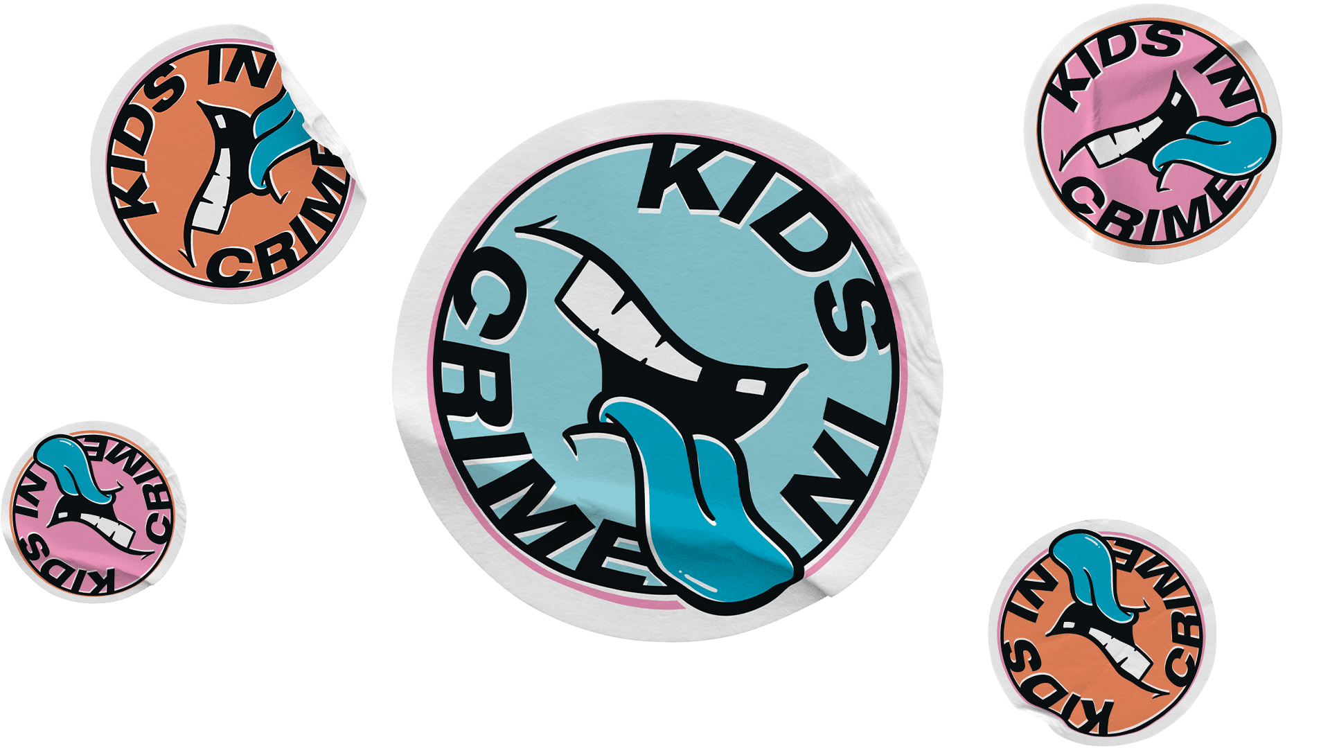
The font chosen to compliment the imagery and logo is inspired by bored kids who scratch letters into their desks and vandalism.

We used the images from disposable cameras to show typical scenes of graphical content of the show with the logo stickers on top of it. All the teasers shared through social media and the digital web also used stickers.
Bidragsytere
- Kenneth Karlstad
- Director
- Morten Foss
- Creative Director
- Jørgen Magnussen
- AD / Kreatør
- Henrik Sæther
- AD / Kreatør
- Nils Hausken
- AD / Grafisk Designer
Leveranser
Ide og konsept, grafisk design og lanseringDato
- Nov 2022
 Skip to main content